Contact
Feel free to reach out through my social media.
Analyzing the structure and dynamics of communication networks within the Enron email dataset to uncover key insights about organizational behavior.
Marco A. García - 26/01/2025
You can find this project in the GitHub repository.
The rise of remote work has transformed the way employees communicate, shifting from face-to-face interactions to digital communication channels such as email. Understanding the dynamics of these communication networks is crucial to improving knowledge transfer, identifying key contributors, and analyzing the robustness of these networks.
In this project, we will explore the social network created by email communication within the Enron Corporation, a U.S.-based energy company that ceased operations in 2001. The dataset, derived from the company’s email records, contains information about 143 employees and their email interactions. Specifically:
The goal of this project is to utilize social network analysis techniques to gain insights into the structure, resilience, and centrality of the communication network, as well as to identify the most influential nodes in the network.
Steps to Complete the Project
Questions to Answer
By addressing these questions, we will uncover key insights into the Enron email network, its structure, and the roles played by individual employees in maintaining its connectivity and information flow.
We will use the following Python libraries to analyze and visualize the Enron email network:
!pip -q install networkx matplotlib numpy pandasimport networkx as nx
import matplotlib.pyplot as plt
import matplotlib.colors as mcolors
import numpy as np
import pandas as pdGreat, let’s start by downloading our email-enron-only.mtx file and
uploading it to our working environment. We’ll use pandas to load it
into a DataFrame, which contains two important columns: Sender (the
employee sending the email) and Receiver (the employee receiving
it). Next, we’ll explore our dataset by printing the first few rows,
checking its structure with info(), and ensuring there are no
duplicates or missing values. This will set a strong foundation for the
analysis we’re about to dive into.
data = pd.read_csv("email-enron-only.mtx", sep=" ", header=None, names=["sender", "receiver"])
print(data.head())
print("\n----\n")
print(data.info())
print("\n----\n")
print(f"Duplicated values: {data.duplicated().sum()}")
sender receiver
0 17 1
1 72 1
2 3 2
3 19 2
4 20 2
----
<class 'pandas.core.frame.DataFrame'>
RangeIndex: 623 entries, 0 to 622
Data columns (total 2 columns):
# Column Non-Null Count Dtype
--- ------ -------------- -----
0 sender 623 non-null int64
1 receiver 623 non-null int64
dtypes: int64(2)
memory usage: 9.9 KB
None
----
Duplicated values: 0Perfect, having no issues with our dataset, we can now move on to
building and visualizing our network. Using NetworkX, we’ll construct
an undirected graph where each node represents an employee, and each
edge represents an email interaction. Once the graph is created, we’ll
visualize it using Matplotlib, customizing the size and color of nodes
and edges for clarity.
G = nx.from_pandas_edgelist(data, source="sender", target="receiver")

print(G)
Graph with 143 nodes and 623 edgesdef draw_graph(G, title):
fig = plt.subplots(figsize=(15, 10))
pos = nx.spring_layout(G)
nx.draw_networkx_nodes(G, pos=pos, node_size=100)
nx.draw_networkx_edges(G, pos=pos, alpha=0.3)
nx.draw_networkx_labels(G, pos=pos, font_size=10)
plt.title(title)
plt.show()draw_graph(G, "Undirected Network of Email Interactions")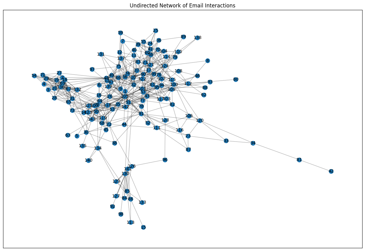
From the graph, we can observe:
A dense central cluster of nodes indicating a gigh level of interconnectivity among certain employees
Several nodes with fewer connections, suggesting less interaction with the main network
With our network visualized, we will now perform an analysis to uncover key properties and structural insights. This step helps us understand the connectivity and overall behavior of the network.
Goals:
def sort_nodes_by_degree(G, reverse=True):
  return sorted([item for item in G.degree()], key=lambda x: x[1], reverse=reverse)

def get_maxium_degree_nodes(G):
  nodes = sort_nodes_by_degree(G, True)

  return [node for node in nodes if node[1] == nodes[0][1]]

def get_minium_degree_nodes(G):
    nodes = sort_nodes_by_degree(G, False)

return [node for node in nodes if node[1] == nodes[0][1]]print(f"Maxium degree nodes: {get_maxium_degree_nodes(G)}")
print(f"Minium degree nodes: {get_minium_degree_nodes(G)}")
print(f"Graph diameter: {nx.diameter(G)}")
print(f"Average shortest path length: {nx.average_shortest_path_length(G)}")Maxium degree nodes: [(105, 42)]
Minium degree nodes: [(15, 1), (42, 1), (63, 1), (80, 1), (92, 1), (98, 1)]
Graph diameter: 8
Average shortest path length: 2.967004826159756def draw_shortest_path_hist(G, title):
node_lengths = dict(nx.shortest_path_length(G))
lenghts = sum([list(i.values()) for i in node_lengths.values()], [])
highest = max(lenghts)
bins = [-0.5 + i for i in range(highest + 2)]
plt.hist(lenghts, bins=bins, rwidth=0.8)
plt.title(title)
plt.xlabel("Distance")
plt.ylabel("Count")
plt.show()draw_shortest_path_hist(G, "Shortest path")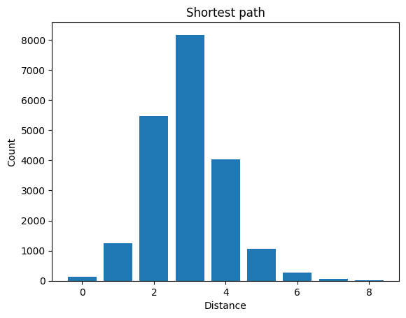
From our analysis of the Enron email network, we can draw the following key insights:
These metrics provide a foundational understanding of the network’s structure, identifying key contributors, peripheral participants, and the efficiency of message transfer within the email system.
Now that we understand the structure of the network, we analyze its resilience (the ability to maintain connectivity when nodes or edges are removed). A resilient network remains functional despite failures or targeted attacks.
def get_random_node(G):
  return [np.random.choice(G.nodes())]
def get_sorted_nodes_by_metric(G, metric, reverse=True):
nodes = metric(G)
if isinstance(nodes, dict):
nodes = [(k, v) for k, v in nodes.items()]
sorted_nodes = sorted(nodes, key=lambda x: x[1], reverse=reverse)
return [node[0] for node in sorted_nodes]def dismantle(G, fn, **args):
g = G.copy()
total_nodes = g.number_of_nodes()
removed_nodes = []
clusters = []
nodes_id = []
n_clusters = []
while len(g.nodes()) > 1:
node = fn(g, **args)
g.remove_node(node[0])
removed_nodes.append((len(removed_nodes) + 1) / total_nodes)
nodes_id.append(node[0])
components = list(nx.connected_components(g))
g_size = 0
if len(components) > 0:
g_size = max([len(c) for c in components]) / total_nodes
clusters.append(g_size)
n_clusters.append(len(components))
return removed_nodes, clusters, nodes_id, n_clustersdef plot_dismantle(x, y, title):
plt.plot(x, y)
plt.xlabel("Removed nodes")
plt.ylabel("Clusters")
plt.title(title)
plt.show()r_removed_nodes, r_clusters, r_nodes_id, r_n_clusters = dismantle(G, get_random_node)
plot_dismantle(r_removed_nodes, r_clusters, "Random")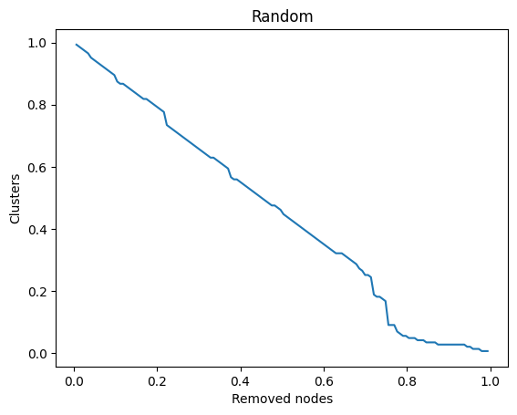
d_removed_nodes, d_clusters, d_nodes_id, d_n_clusters = dismantle(G, get_sorted_nodes_by_metric, metric=nx.degree_centrality)
plot_dismantle(d_removed_nodes, d_clusters, "Degree Centrality")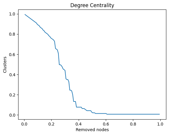
print(f"Articulation points (critical nodes): {list(nx.articulation_points(G))}")
print(f"Bridges (critical edges): {list(nx.bridges(G))}")
Articulation points (critical nodes): [81, 34, 112, 85, 130, 141, 53]
Bridges (critical edges): [(112, 80), (53, 63), (85, 15), (141, 92), (34, 81), (81, 42), (130, 98)]def critical_nodes_colors(G, critical_nodes):
node_colors = []
for node in G.nodes():
if node in critical_nodes:
node_colors.append("red")
else:
node_colors.append("cyan")
return node_colors
def critical_edges_colors(G, critical_nodes):
edge_colors = []
for edge in G.edges():
if edge[0] in critical_nodes or edge[1] in critical_nodes:
edge_colors.append("red")
else:
edge_colors.append("black")
return edge_colors
def draw_critical_graph(G, critical_nodes, title):
fig = plt.subplots(figsize=(15, 10))
pos = nx.spring_layout(G)
nx.draw_networkx_nodes(
G,
pos=pos,
node_size=100,
node_color=critical_nodes_colors(G, critical_nodes)
)
nx.draw_networkx_edges(G, pos=pos, alpha=0.3, edge_color=critical_edges_colors(G, critical_nodes))
nx.draw_networkx_labels(G, pos=pos, font_size=10)
plt.title(title)
plt.axis('off')
plt.show()draw_critical_graph(G, list(nx.articulation_points(G)), "Critical Nodes")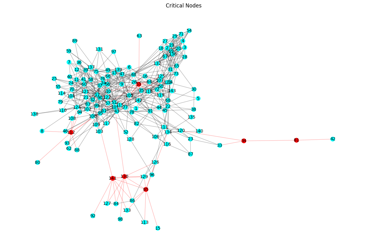
The resilience analysis of the Enron email network reveals the following key findings:
To understand the most influential nodes in the network, we analyze three types of centrality measures: degree centrality, betweenness centrality, and closeness centrality. These measures highlight nodes based on different criteria of importance.
def draw_centrality_graph(G, measures, title):
  plt.figure(figsize=(15, 12))
  pos = nx.spring_layout(G)
  nodes = nx.draw_networkx_nodes(
      G,
      pos,
      node_size=100,
      cmap=plt.cm.plasma,
      node_color=list(measures.values()),
      nodelist=list(measures.keys())
  )
  nx.draw_networkx_edges(G, pos, alpha=0.2)
  nx.draw_networkx_labels(G, pos, font_size=6)
  plt.title(title)
  plt.colorbar(nodes)
  plt.axis('off')
  plt.show()
sorted_degree_centrality = sorted(list(dict(nx.degree_centrality(G)).items()), key=lambda x: x[1], reverse=True)
top_degree_centrality = [node[0] for node in sorted_degree_centrality][:10]
draw_critical_graph(G, top_degree_centrality, "Top 10 Degree Centrality")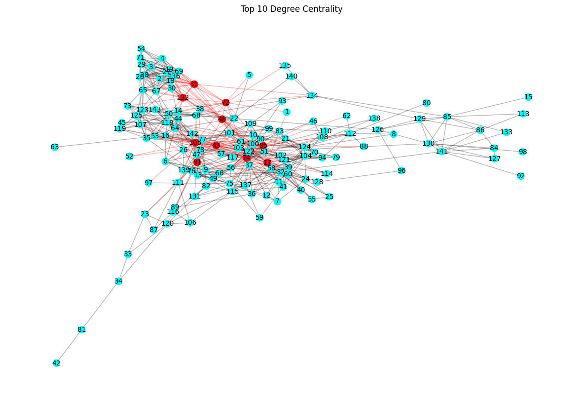
draw_centrality_graph(G, nx.degree_centrality(G), "Degree Centrality")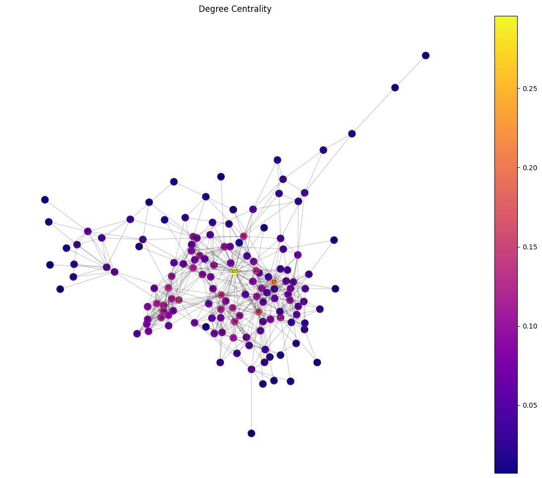
sorted_betweenness_centrality = sorted(list(dict(nx.betweenness_centrality(G)).items()), key=lambda x: x[1], reverse=True)
top_betweenness_centrality = [node[0] for node in sorted_betweenness_centrality][:10]
draw_critical_graph(G, top_betweenness_centrality, "Top 10 Betweenness Centrality")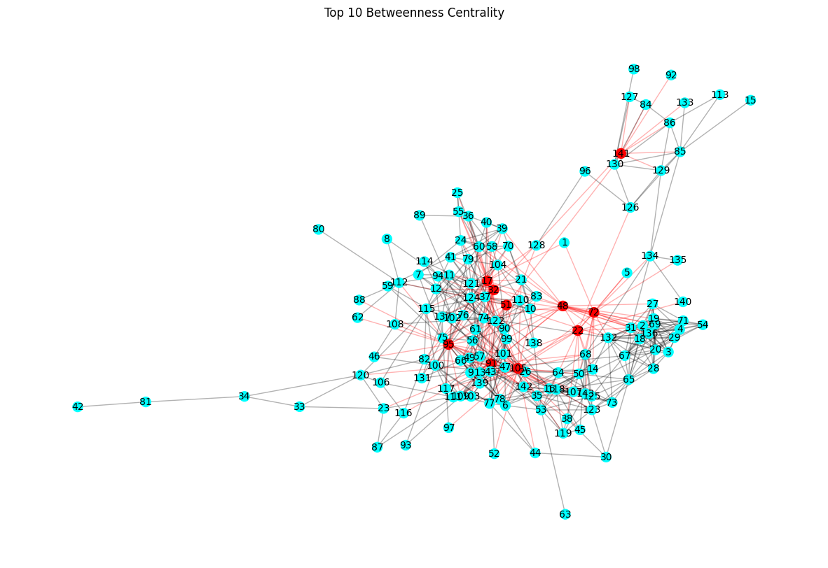
draw_centrality_graph(G, nx.betweenness_centrality(G), "Betweenness Centrality")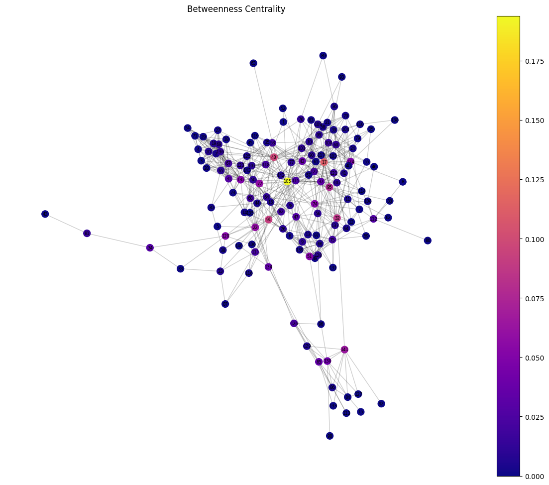
sorted_closeness_centrality = sorted(list(dict(nx.closeness_centrality(G)).items()), key=lambda x: x[1], reverse=True)
top_closeness_centrality = [node[0] for node in sorted_closeness_centrality][:10]
draw_critical_graph(G, top_closeness_centrality, "Top 10 Closeness Centrality")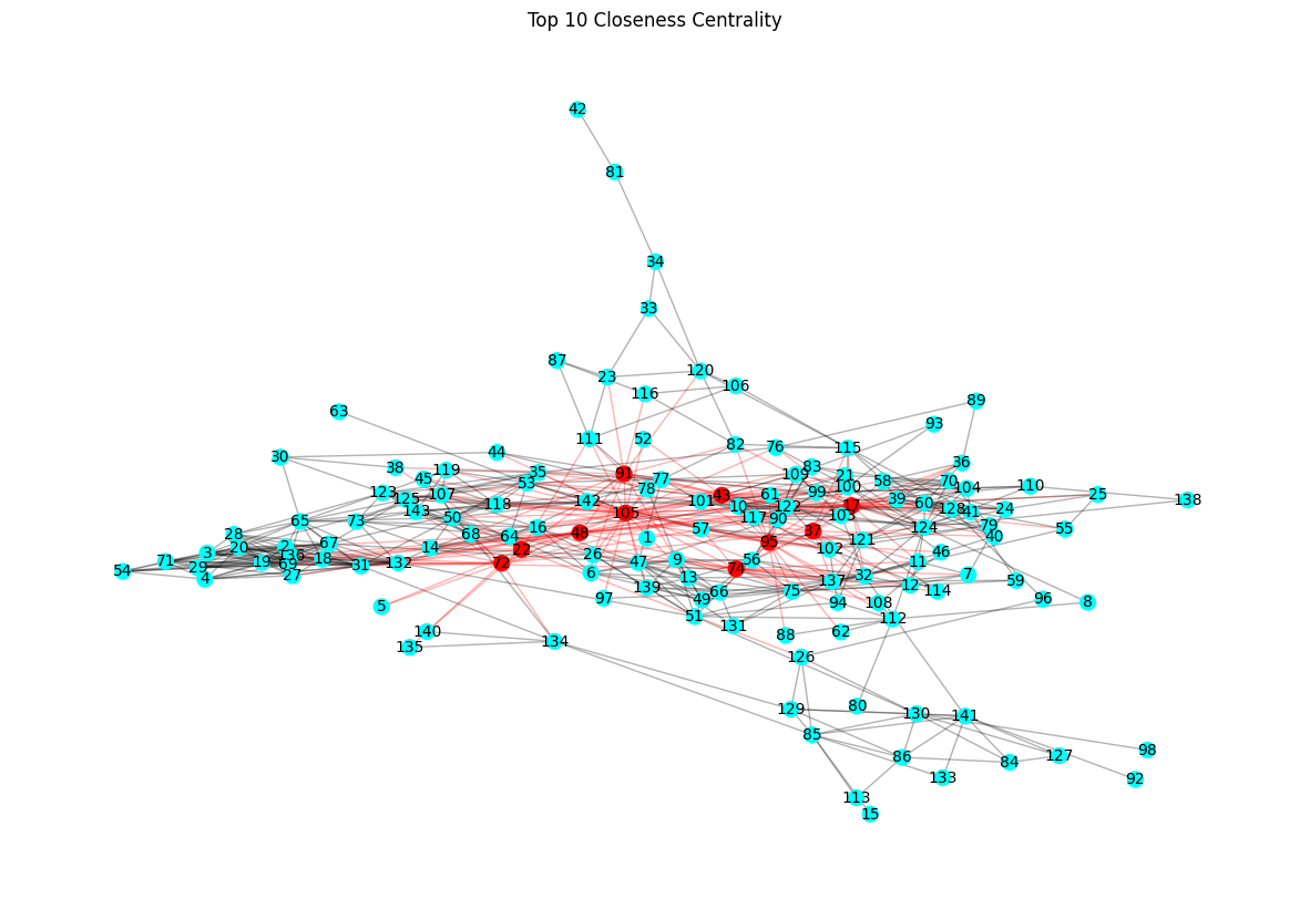
draw_centrality_graph(G, nx.closeness_centrality(G), "Closeness Centrality")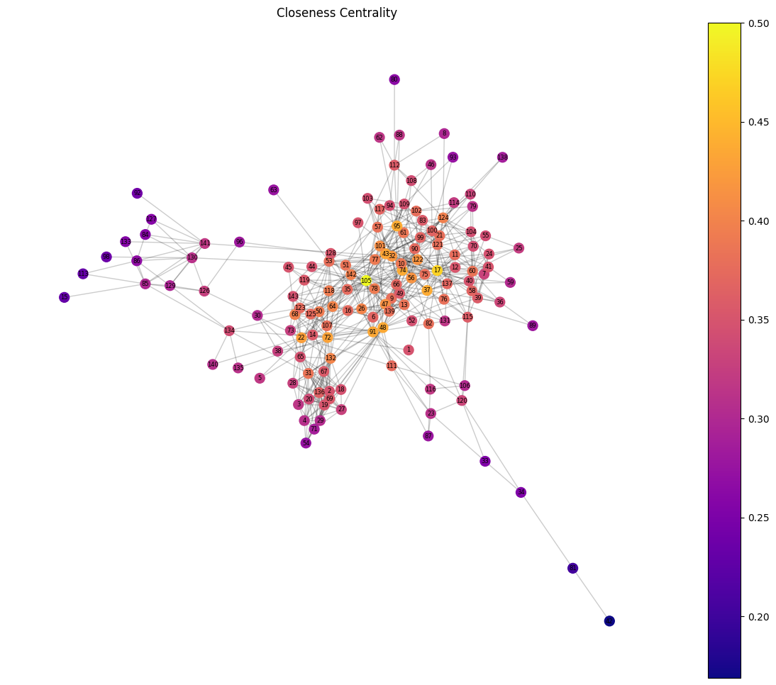
Analyzing the centrality measures of the Enron email network reveals key insights into the most influential nodes:
After analyzing the undirected network, we now consider the directionality of email exchanges by constructing a directed graph. This allows us to capture who sends and who receives emails, adding a new layer of insight into the communication dynamics.
D = nx.from_pandas_edgelist(data, source="sender", target="receiver", create_using=nx.DiGraph)
print(D)
DiGraph with 143 nodes and 623 edgesdraw_graph(D, "Directed Network of Email Interactions")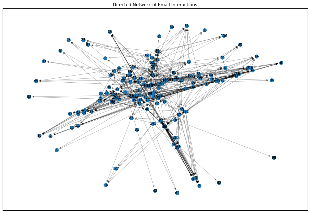
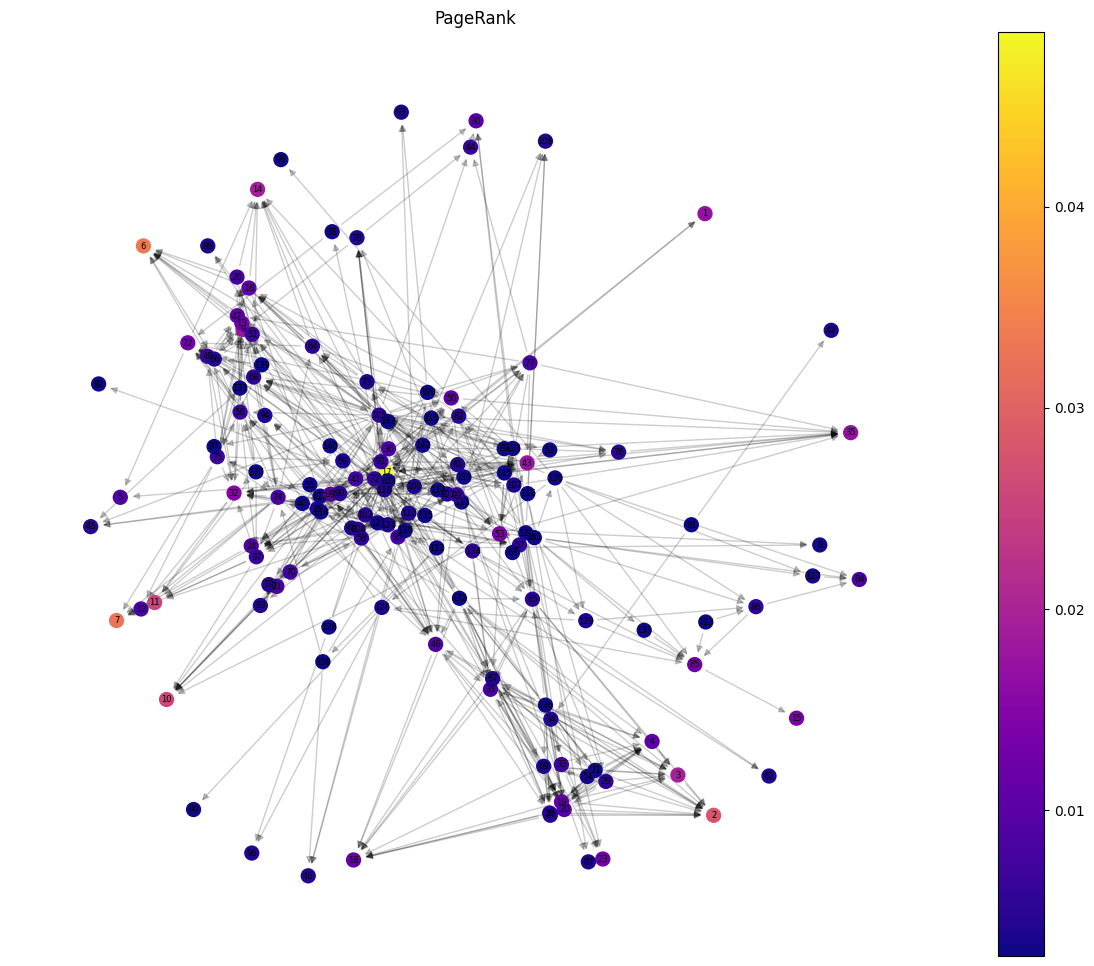
Nice, having our directed graph (DiGraph) built, we’ll now observe the PageRank of the nodes to understand their influence within the flow of communication. Unlike the undirected graph, this analysis takes into account the direction of email exchanges, highlighting not just who is connected but also how information flows across the network.
pr = nx.pagerank(D)
draw_centrality_graph(D, nx.pagerank(D), "PageRank")
The highest PageRank score is assigned to node 17, making it the most influential node in the network. This node acts as the primary hub, receiving emails from other significant nodes and ensuring the effective flow of communication.
The Enron email network demonstrates a highly connected and efficient communication structure, with nodes 105 and 17 as its central figures. Node 105 dominates the undirected analysis due to its high connectivity, while node 17 leads in the directed graph, highlighting its influence in the flow of information. Despite its resilience to random failures, the network’s reliance on critical nodes and edges presents vulnerabilities under targeted attacks. This analysis underscores the importance of key players and the need to address vulnerabilities to ensure robust organizational communication systems.
Feel free to reach out through my social media.